AEM6.3 + feature pack 20593 – The new component style system
Feature pack 20593 for AEM6.3 has been released recently and includes a new feature in AEM Sites called “Style system for components”. This feature allows template authors to define style classes in the content policy of a component. These styles can in turn, be used directly on components during page editing.
The benefits for your content team are;
- flexibility in visual representations
- reusable and easily adaptable components
- elimination of extra AEM development requests for small style changes.
Demo use-case
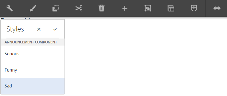
Imagine you, as a template editor, want to give your authoring team the possibility to easily change the “feel” of the announcement. E.g; on a blog page, there can be funny, sad and serious announcements. You could use the style system to easily accomplish this.
The style system renders the paintbrush icon on the action bar of a component. This icon indicates the styling system has been set up for this component. When you click it, custom styles can be selected.
Technical setup
To demonstrate this feature, we’ve created a small demo site, based on the aem-project-archetype. You can check out the project over here. You can deploy this project on an AEM6.3 instance with feature pack 20593 (Look for it on the Package Share). Have a look at the contents of the project.
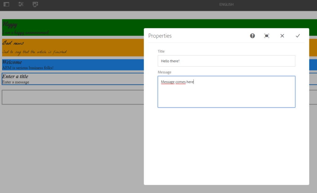
The announcement component
We’ll demo the style system on a custom component. It’s a very basic component that accepts a Title and Message.
The component policy
Component policies? That’s right, since AEM6.3, “Designs” are a bit a thing of the past. Policies are the modern way to define rules for templates, but they are also very handy to set configuration properties on components. Our beloved Styles selector is also defined on the policy of the announcement component. Go to the English language page and select the Root Layout container.
Then, click the Page Information icon in the top bar and click on “Edit Template”. You are now looking at the visual representation of the policy of the layout container on our demo site.
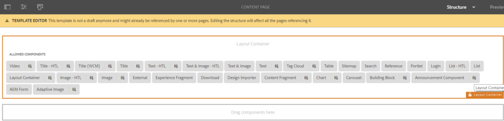
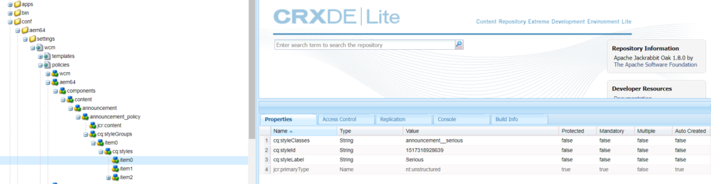
All grey boxes are (allowed) components of the layout container. You’ll also notice that some of them have the small Policy icon display next to them. This means these components support having a policy, and if you take a look in CRX, you’ll see that these components have a cq:design_dialog node. The design dialog configuration node enables the component to have a policy.
Pay special attention to the styletab node in the cq:design_dialog…
<styletab
 jcr:primaryType="nt:unstructured"
 sling:resourceType="granite/ui/components/coral/foundation/include"
 path="/mnt/overlay/cq/gui/components/authoring/dialog/style/tab_design/styletab"/>
…this piece of configuration is needed to make the styles work on core v1.0 components or your custom component. Adobe has just released v2.0 of the core components, who have built-in support for the styling system, so no need to add the styletab node yourself to these. Have a look here to download and install the v2.0 core components.
The relation with our custom css classes
Click on the policy icon of the Announcement component. The « Allowed Styles » section let’s you map meaningful style names (which are readable for your authors) to CSS classes. These CSS classes are part of our project. In this case, they reside in the site’s clientlib under base.less.
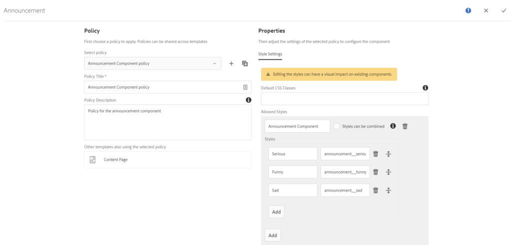
.announcement__sad {
 font-family: LaBelleAurore;
 background-color: orange;
}

.announcement__funny {
 font-family: PlayfulPacifico;
 background-color: green;
}

.announcement__serious {
 background-color: dodgerblue;
}
In your CRX, you’ll notice this entire configuration is saved on the policy of the announcement component under the cq:styles node. Each style entry has it’s own node with the exact mapping.
When changing the style on an announcement component, you’ll see that our configured classes are used on the page.
Simple isn’t it?
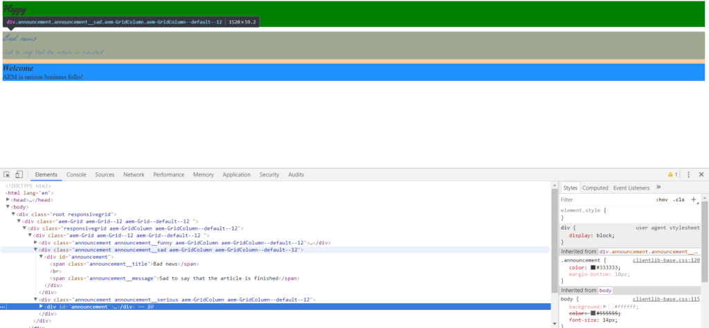
In case you wonder how AEM knows how to render the correct style for a component; the styleId’s that are associated with our component, are in turn stored in CRX on the content node of the announcement in a String array.